The Psychology of Color in Logo Design
Why certain palettes feel premium, why others feel cheap, and how to choose colors that earn trust at first glance.
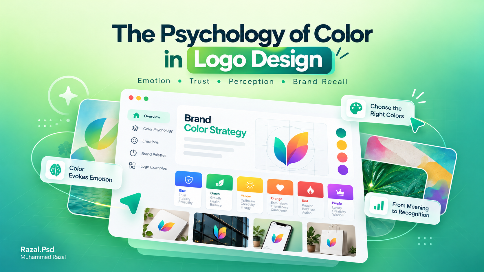
Colour is the fastest signal a brand sends. Before anyone reads a word, they have already formed an impression from the colours. That makes colour one of the most important decisions in a logo, and one of the easiest to get wrong.
This article covers how to choose logo colours on purpose: meaning, contrast, cultural context, accessibility and the practical checks that separate a considered palette from a random one.
Colour sets expectations
Colours carry associations, but they are not fixed rules. Green often suggests nature or freshness, deep blues feel calm and trustworthy, and black with gold reads as formal or luxurious. What matters is whether the colour matches what the business actually offers. A bright, playful palette can be perfect for a juice bar and wrong for a law firm.
Contrast matters more than the exact shade
A logo is often seen small, on busy backgrounds or in poor light. Strong contrast between the mark and its background keeps it readable. Before settling on a palette, check the logo:
- in one colour (black, and white on a dark background)
- at very small sizes, such as a profile picture
- printed, not only on a bright screen
If the logo only works in its full colours, the design needs another look.
Cultural meaning in Kerala
Colour meanings are shaped by culture. In Kerala, white and gold are strongly linked with Onam, weddings and the kasavu saree, and green with the landscape. These associations can make a local brand feel familiar and warm, but they can also make it look like every other festival design. Use them deliberately, not by default.
Accessibility
Some people find certain colour pairs hard to tell apart, especially red and green. Don't rely on colour alone to carry meaning, and keep enough contrast between text and background in anything built from the brand palette, such as posts, menus and websites.
Fewer colours, used consistently
Most strong identities use one or two main colours plus neutrals. A small palette is easier to apply consistently across print and screen, and consistency is what makes people remember the brand.
Record the exact values
Once chosen, write down the exact codes: HEX or RGB for screens, CMYK for printing and, where needed, Pantone references. Colours shift between screens and printers, so these values keep the brand looking the same everywhere.
A quick checklist
- Does the colour fit what the business offers and who it serves?
- Does the logo still work in one colour?
- Is it readable small and on different backgrounds?
- Is it different enough from close competitors?
- Are the exact colour values recorded for print and screen?
Colour choices are part of every logo design and brand identity project I take on. If you're choosing colours for a new brand, get in touch.
Working on something similar?
Tell me about your project and what it needs to do.
Keep reading
Why Most Logo Designs Fail After Launch
A logo might look great in a presentation but fail in real-world applications.Read article
How to Prepare a Design Brief (With a Simple Template)
A good brief is the fastest way to good design. What to include, what to leave out, and a copy-and-paste template you…Read article