How to Build a Premium Brand Identity in 2026
A practical 7-step framework for crafting a brand identity that feels considered, distinctive, and built to last.
Building a premium brand identity is not about polish for its own sake. It is about clarity of intent: every choice, from the logo to the paper a menu is printed on, should come from one clear idea of who the brand is for and how it should feel.
This is the 7-step process I follow for brand identity projects, from the first conversation to the final guidelines.
1. Discovery: understand the business first
Before any sketching, I need to understand what the business sells, who buys it, what they compare it with and why they should choose it. A short conversation and a written brief cover the basics: audience, price level, competitors, and where the brand will appear most.
The output of this step is a single sentence describing the feeling the brand should leave behind. Everything else is checked against it.
2. Positioning: decide what makes it different
Premium brands rarely try to appeal to everyone. Write down what the brand is and, just as importantly, what it is not. A cafe can be "calm, crafted and local" rather than "fun and cheap". These few words guide every later decision.
3. Moodboard and direction
A moodboard collects references for typography, colour, photography and texture that match the positioning. It is agreed with the client before any logo work starts. This is the cheapest moment to change direction, and it prevents surprises later.
4. Logo system
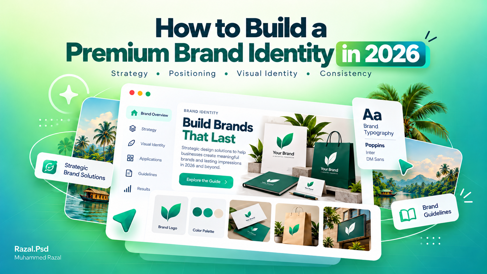
A premium logo is usually simple. It should read clearly at small sizes, work in one colour, and come as a system: a primary logo, a compact version and an icon or monogram. I test each concept on real placements, such as a profile picture, a shop board and packaging, before presenting it.
5. Typography and colour
Restraint is what makes an identity feel considered. Two typefaces (one for headings, one for text) and a small palette with exact values for screen and print are usually enough. Leaving space around elements matters as much as the elements themselves.
6. Applications
An identity only proves itself when applied. Design the pieces the business will actually use first: social media templates, menus, packaging, signage, stationery. This is where inconsistencies show up and get fixed.
7. Guidelines and handover
The final step is a short guide explaining how to use the logo, colours and type, with examples of what to avoid, plus organised files for print and screen. Good guidelines let anyone, including staff or another designer, keep the brand consistent for years.
Putting it together
None of these steps is complicated on its own. What makes an identity feel premium is doing all seven with care and keeping them consistent. You can see branding projects in my portfolio, such as the Sun Base and Smash Cafeteria identities, and read what a project includes on the brand identity service page.
Planning a new brand? Send me a short brief.
Working on something similar?
Tell me about your project and what it needs to do.
Keep reading
Why Every Small Business in Kerala Needs Professional Branding
Discover why professional branding matters for small businesses in Kerala, from memorable logos and brand identity to…Read article
How to Pick the Right Logo Designer in Kerala (Without Wasting Money)
Looking for the right logo designer in Kerala? Discover how to compare portfolios, understand logo design pricing…Read article