Why Most Logo Designs Fail After Launch
A logo might look great in a presentation but fail in real-world applications.
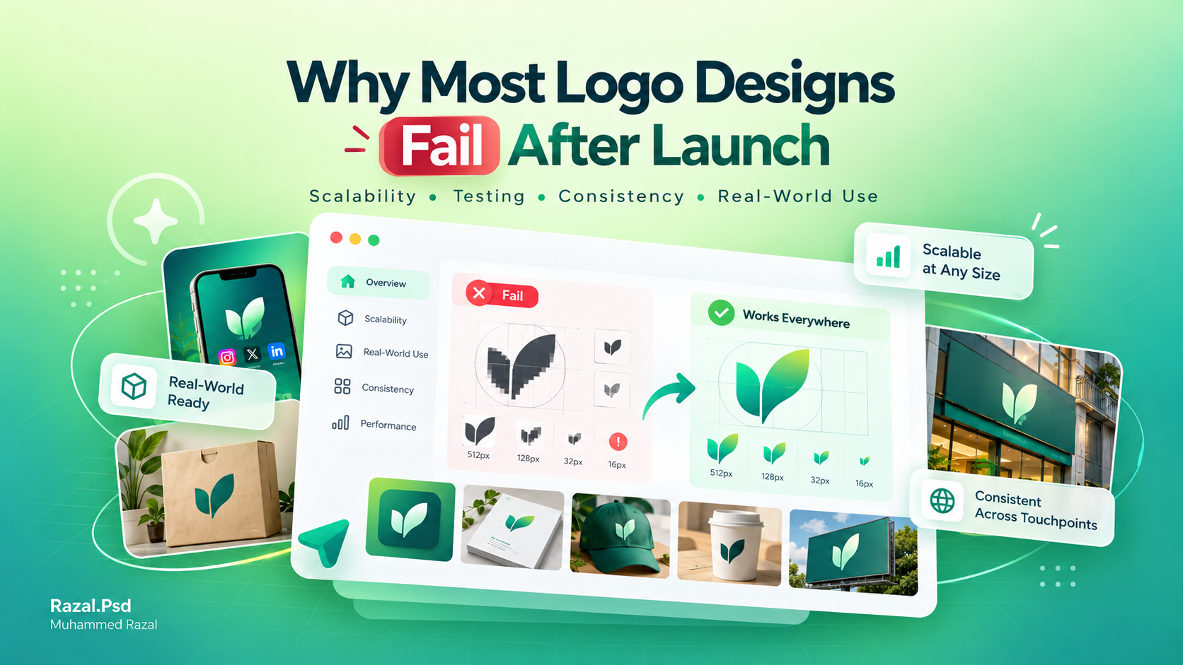
A logo can look great in a presentation and still fail in real life. Most logo projects focus on how the mark looks on a large screen, and forget how it will actually be used: on packaging, a shop board, a delivery bag, a WhatsApp profile picture or a one-colour receipt.
The goal isn't a beautiful logo. The goal is a useful one. Here is what goes wrong, and how to avoid it.
Common logo design mistakes
- Too much detail. Fine lines and small text disappear at small sizes and in embroidery or printing.
- Depending on effects. Gradients, shadows and glows can look impressive on screen but fail in one-colour print, signage and embroidery.
- Following a trend. A logo built on this year's style can feel dated quickly.
- Only one version. A single wide logo can't fit a square profile picture or a narrow sign.
- Unreadable names. Decorative lettering that people can't read defeats the purpose.
Scalability
A logo has to work from very small to very large. Test it at the size of a social media profile picture and on a large banner. If details merge together when small, simplify them. Vector master files (AI, SVG, EPS or PDF) let the logo scale without losing quality.
Responsive logo systems
Instead of one logo, design a small family:
- a primary logo for most uses
- a stacked or compact version for square and narrow spaces
- an icon or monogram for profile pictures and app icons
- one-colour versions for print, stamps and embroidery
Each version is recognisably the same brand, but fits its space properly.
Real-world testing
Before approving a logo, place it where it will actually be used. Mock it up on the shop board, a product label, an Instagram profile, a business card and a printed bill. Print it in black and white. View it from across a room. Problems that are invisible in a presentation become obvious very quickly.
Designing for long-term growth
Think about where the business might be in a few years. Will it add products, open another location or move online? A clear, simple mark with a defined colour palette and typeface can grow with the business, while a logo tied to one product or trend may need replacing.
Checklist before you approve a logo
- Readable at profile-picture size
- Works in one colour
- Has horizontal, stacked and icon versions
- Tested on real placements, not only on screen
- Delivered as vector files with colour codes
These checks are built into my logo design process. For a deeper guide to choosing a designer, read How to Pick the Right Logo Designer in Kerala.
Working on something similar?
Tell me about your project and what it needs to do.
Keep reading
The Psychology of Color in Logo Design
Why certain palettes feel premium, why others feel cheap, and how to choose colors that earn trust at first glance.Read article
How to Prepare a Design Brief (With a Simple Template)
A good brief is the fastest way to good design. What to include, what to leave out, and a copy-and-paste template you…Read article