Shift Collective
Project Overview
Shift Collective is a catering and event services brand working on weddings, corporate gatherings and celebrations in Kerala. I designed its visual identity: a logo system, colour palette, typography and a set of brand applications that position the business as a premium, modern choice.
The aim was to move away from generic catering visuals and build one consistent design language based on sophistication, precision and warmth.
Problem
Shift Collective offers catering and event services for weddings, corporate gatherings and celebrations. The brief was to give the business an identity that feels premium and modern while staying warm and rooted in Kerala, and that clearly sets it apart from general catering providers.
The identity had to work across very different places: menus and brochures, staff uniforms, vehicles, event signage, social media and a website.
Research & Strategy
Our strategic phase analyzed high-end hospitality and contemporary branding rather than just local competitors. The target audience (luxury wedding planners, NRI clients returning for weddings, and corporate executives) prioritizes trust, absolute logistical precision, and aesthetic distinction. We defined the brand essence as "Curated Excellence." The strategic visual approach centered on balancing regional warmth and hospitality (represented by rich colors and warm gold accents) with modern, understated global luxury (a clean, geometric monoline emblem and sophisticated serif typography). The keyword "collective" needed to be visualized not as a simple list, but as a seamlessly integrated force.
Logo Development
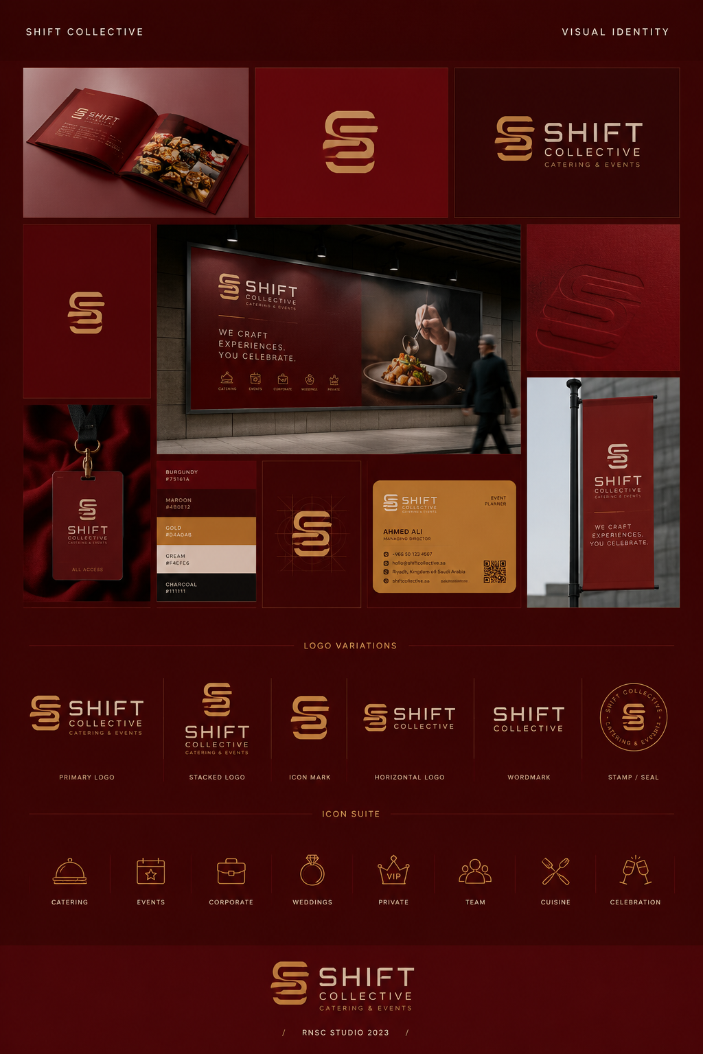
The identity is built around a geometric "S" monogram drawn from continuous parallel lines, suggesting flow and seamless execution. The mark stays clear from small sizes, such as an app icon or profile picture, up to large banners.
The full logo pairs the monogram with a high-contrast serif for "SHIFT" and the descriptor "COLLECTIVE — CATERING & EVENTS —", in stacked and horizontal versions.
Typography
The typographic suite focuses on sophistication and absolute clarity. For main titles and high-impact branding, we employed a premium serif that carries an air of heritage and prestige. This is balanced against a sleek, legible geometric sans-serif for body copy and contact details. This contrast ensures that elegant multi-course menus are easily readable, corporate proposals feel authoritative, and the digital experience remains seamless, reinforcing the professional precision of the group.
Color Palette
The palette is led by a deep burgundy (#75161A) with a darker maroon (#4B0E12) and a light accent (#DAA0AB). A soft cream (#F4EFE6) is used for type and background areas so the rich colours don't feel heavy, and a near-black (#111111) is reserved for technical print.
Brand Applications
The system was applied across a set of touchpoints:
Hospitality material: menus and banquet brochures using burgundy fields and the gold-toned logo. Stationery: business cards and letterheads with the monogram. Gifts and merchandise: notebooks and branded boxes. Staff: ID lanyards and subtle apparel branding. Vehicles: the 'S' pattern and logotype on transport. Signage: directional signs and event banners. Digital: social media layouts and a website interface.
Mockups
The identity is presented in mockups, including an outdoor billboard pairing the stacked logo with the line "WE CRAFT EXPERIENCES. YOU CELEBRATE.", a debossed 'S' on a leather menu cover, branded gift boxes and a vertical event banner.
Final Outcome
The final deliverable is a complete identity system: the monogram and logo versions, colour palette, type pairing and a set of applications covering print, staff, vehicles, signage and digital use. Together they give every touchpoint, from the first social media post to the printed menu, one consistent and recognisable look.